The most expensive hour of a commercial shoot happens weeks before anyone opens a lens case. It happens in the silence where a strategy call should have been, and you pay for it later in retouching invoices, in campaign launches pushed back, in a gallery of pictures that look like five different companies took turns being photographed.
I want to walk through the preparation sequence the way we actually run it, from first principles rather than from a checklist someone copied off a blog. Every step below exists because skipping it produced a measurable, annoying consequence.
Contents
- Twelve Hours of Retouching Nobody Budgeted For
- Turning Brand Adjectives Into Kelvin and Contrast
- Wardrobe That Survives a High-Resolution Sensor
- Props Borrowed From the Actual Desk
- Reading a Room for Light Before You Book It
- Lock the Sequence and Send It Ten Days Out
Twelve Hours of Retouching Nobody Budgeted For
Here is the arithmetic that changed how we book commercial work. When a session runs without an upfront discovery phase, the resulting gallery arrives on the editing desk in pieces: three frames lit warm, four lit cool, backgrounds that shift character from shot to shot, skin tones that refuse to reconcile. Pulling that into a single coherent set takes somewhere between twelve and fifteen hours of corrective retouching and color grading. Not creative work. Salvage work.
That figure is the whole argument for preparation, and it is why nothing gets packed until a strategy call of at least forty-five minutes has happened. Forty-five minutes of talking saves the better part of two working days at the calibrated monitor.
Consider what a prepared session produces instead. You walk away with a library of images that share a lighting logic, a color signature, and a point of view. Those images crop for a website header, a LinkedIn banner, a trade-show panel, and a press kit without anyone noticing they came from the same afternoon. That versatility is the actual deliverable. The individual photographs are just the format it ships in.
Strategic alignment is a marketing decision that happens before it becomes a photographic one. The U.S. Small Business Administration publishes official guidelines on marketing and branding strategy that are worth reading the week before your discovery call, if only to arrive with your positioning already articulated in plain language.
Turning Brand Adjectives Into Kelvin and Contrast
"Innovative." "Trustworthy." "Approachable." These words mean nothing to a camera. The translation work, and it genuinely is translation, involves extracting the core adjectives from a brand's positioning and pairing each one with a lighting ratio and a color temperature that the photography team can dial in on set.
Approachability tends to live around a warm 3200K, with soft falloff and a gentle contrast ratio that keeps shadows open. Modern innovation reads cooler and cleaner, closer to a crisp 5600K, with harder edges on the key light and more separation between subject and background. Trustworthiness usually sits somewhere between, favoring symmetry and eye-level framing over dramatic angles. Once you have made those pairings explicit, the technical crew stops guessing.
Building a Mood Board That Actually Directs the Crew
Generic inspiration folders failed us for years. A board full of finished portraits tells a photographer what the client likes, which is nearly useless information on shoot day. What works is a curated set of fifteen to twenty-five reference images chosen for a single attribute each: this one for the quality of window light, this one for the texture of the wall, this one for the color relationship between the jacket and the backdrop.
Fifteen is the floor because fewer references leave too much interpretive room. Twenty-five is the ceiling because beyond that the board starts contradicting itself and becomes a source of debate rather than a source of direction.
Mood Boards Bend on Site
One catch worth stating plainly. A mood board sets direction, and it cannot control weather or architecture. Sudden cloud cover over a Maryland estate will change your key light by more than a stop in the space of a minute, and the spatial constraints of a historic venue may simply refuse the camera position your reference image implies. Adaptable execution on the day is part of the job, and a good board is written to survive that adaptation rather than break under it.
Wardrobe That Survives a High-Resolution Sensor
Clothing is the fastest signal in the frame. Before a viewer processes the subject's expression or the environment behind them, they have already read the garment and drawn conclusions about competence, warmth, and industry. That reading happens in a fraction of a second and it is almost entirely subconscious.
The approach that has held up best is layering structured pieces over neutral bases. A tailored jacket over a plain knit projects authority; remove the jacket and the same subject reads as approachable and available. Two looks, one setup, no wardrobe room required. Each transition of that kind takes three to five minutes, which means your paid camera time stays camera time instead of becoming changing-room time.
Color discipline matters as much as silhouette. A core palette of three to four complementary colors that harmonize with the brand's primary logo marks keeps the entire gallery usable in branded layouts. Introduce a fifth color and you have created a set of images that fight the design system they were commissioned to serve.
Houndstooth Ends Campaigns
A subject once arrived with a tight houndstooth blazer and a pinstripe shirt as backup. Both produced heavy moiré on a high-resolution sensor, that shimmering interference pattern that appears where a fine repeating weave collides with the pixel grid. The frames were unusable for digital advertising and no amount of retouching brought them back. Tight repeating patterns, narrow stripes, and visible garment logos stay home.
Props Borrowed From the Actual Desk
There is a particular flatness to images built from purchased props. Pristine notebooks, unopened laptops, a coffee cup nobody has ever drunk from. Viewers cannot always name what feels wrong, and they register it anyway.
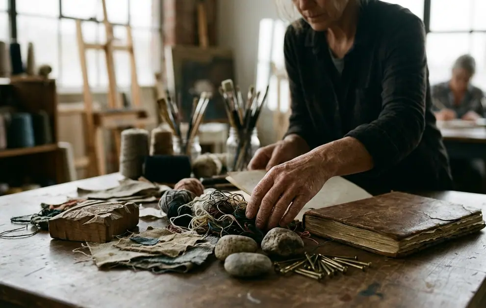
So the production team audits the subject's real workspace instead. Worn drafting pencils with the paint chewed off the barrel. A specific fabric swatch book with dog-eared corners. The chipped mug. Objects that carry evidence of use ground a person in their professional reality faster than any pose ever will.
Three Categories Worth Gathering
- Tools of the trade: the instruments the subject touches daily, in the condition they are actually in.
- Lifestyle indicators: objects that place the subject in a world, such as a well-used field notebook or a pair of boots by the door.
- Subtly branded collateral: packaging, a business card, a product sample, positioned so the mark is legible but never shouting.
Placement is where most prop work goes wrong. Set contextual objects three to four feet behind the subject and render them at a shallow depth of field. They become soft, readable suggestions of environment rather than competing focal points. Limit yourself to two or three contextual items per frame; a fourth tips the composition into clutter and the eye starts wandering instead of landing on the face.
Reading a Room for Light Before You Book It
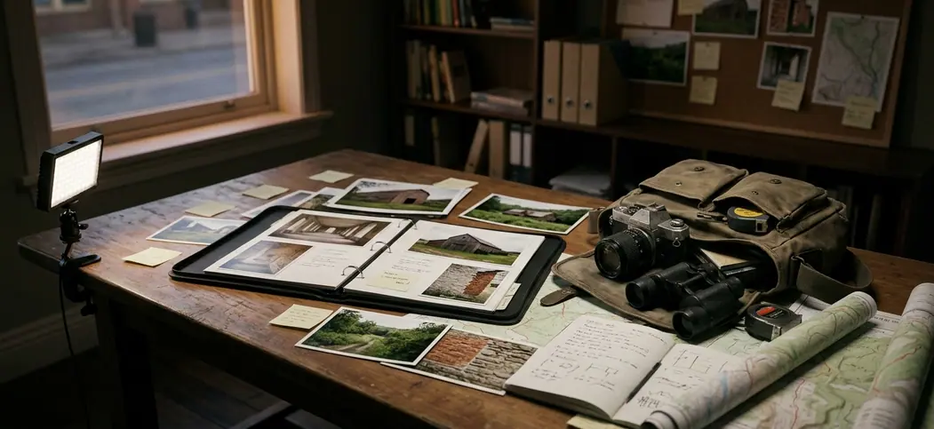
Convenience is the worst reason to choose a location. Architectural character and the directionality of natural light are the criteria that survive contact with the final gallery, which is why we push toward spaces with genuine Mid-Atlantic texture: exposed beam work, tall original windows, the weathered timber and water light you find around Deep Creek Lake, MD. Those surfaces do half the storytelling before a strobe fires.
Two technical thresholds govern whether a beautiful room is also a workable one. You need roughly four hundred square feet of unobstructed floor to place lighting modifiers, backdrop stands, and a camera position with enough distance for a flattering focal length. And you need backgrounds free of visual noise, because every stray power cord and mismatched chair becomes a retouching line item.
Studio Control Against On-Site Truth
A controlled studio gives you precise, repeatable strobe ratios. Set the key at a fixed distance, meter it once, and every frame across a four-hour session matches. That repeatability is worth a great deal when the deliverable is a large, consistent library.
An active workspace gives you something a studio cannot manufacture: the actual room where the work happens, with its own light and its own history. The cost is complexity. The photographer must dynamically blend ambient fluorescent or window light with portable modifiers, and those sources rarely agree on color temperature. Choose the studio when consistency outranks context, and choose the workspace when the environment is part of the brand story.
Scout at Shoot Hour
Visit the location forty-eight to seventy-two hours before the session, at the exact clock time the shoot is scheduled. Photograph the room on a phone and note where shadows fall. Light at 10 a.m. in a west-facing conference room bears no resemblance to light at 3 p.m., and discovering that on the day costs you the best hour of the booking.
Lock the Sequence and Send It Ten Days Out
Draft the shot list now, before the details blur. Every entry needs three fields: the specific setup, the props required, and the wardrobe layer in play. Vagueness here converts directly into lost minutes later.
Then sequence it by lighting zone and architectural backdrop rather than by outfit. This is counterintuitive and it is the single largest time saver in the whole process. Shooting every frame that uses the north window before touching the brick wall setup means the crew rebuilds the lighting once instead of five times. Wardrobe changes are cheap; relighting a room is not.
Build fifteen to twenty minutes of buffer into the schedule for each major location or lighting change. A timeline without buffer is a wish, and it collapses at the first delayed arrival.
Pre-Shoot Alignment Checklist
- Finalize the visual mood board with fifteen to twenty-five texture and lighting references.
- Confirm wardrobe selections, ensuring three to four layered options free of distracting patterns.
- Audit and gather two to three authentic workspace props per planned setup.
- Scout the location forty-eight to seventy-two hours out, at the shoot's exact start time.
- Sequence the shot list by lighting zone, with buffer blocks written in.
Now do the thing that makes all of it real: send the finalized shot list and timeline to your photographer seven to ten days before the session. Not the morning of, not the night before. Ten days gives the team room to source the missing modifier, confirm the room dimensions, and arrive already knowing what the first three frames look like.